
The recent remake of the fan-favorite 4-koma series Azumanga Daioh’s first volume has attracted much attention, due to the vastly redrawn artwork by the original mangaka Kiyohiko Azuma.
As his style has changed substantially from 1999’s Azumanga to today’s currently running Yotsuba&!, the differences in some panels is truly striking, influencing one fan to create a comprehensive side-by-side comparison of the new and old versions, as can be seen below…
To begin with, a recent entry on Azuma’s personal site provides some of the artist’s thoughts on redrawing his most popular work.
Here is an excerpt of the most relevant portions:
And so, I drew Azumanga for the first time in a long while.
I’m sure it might cause uncomfortable feelings for some fans, but it is the Azumanga of Today.
I struggled with exactly how much of my old style to bring back, but for the most part I went with my most current style.
Looking at it from my own perspective, trying to bring back some of my older style makes me feel like I’m purposefully making the art look worse, so it was a little painful for me to do.
Even with my style of 4-koma, looking back at it now makes me think about how simplistic it was.
As for the drawing method I used, I adopted the thought of making changes to the exterior surface, but still make it so that it would easily fit into the “core” of Azumanga.
Intrigued by the profound differences found in the new version, Sangencyaya collected these comparison images:
Eyes
Old

New

The new style does indeed resemble Azuma’s more recent art in Yotsubato:
Youtsubato Example Art

Here is another eye comparison, this time of Chiyo – it is worth mentioning that the early chapters of Azumanga were done in 1999, quite early in Azuma’s career, and Azumanga’s art did improve over its 3 year run:
Old

New

The resemblance to Yotsubato’s style is particularly obvious here.
Tone
This is substantially harder to spot, but changes in the toning, or shading used was also noticed:
Old

New

In the original, toning was used to color the inside of an open mouth, and to accentuate the character’s shadows, but the new version lacks it, creating a more minimalistic look.
Character Lines
The script is mostly unchanged, but there are some exceptions, some due to repositioning portions of the text elsewhere on the page, among other reasons…
Old
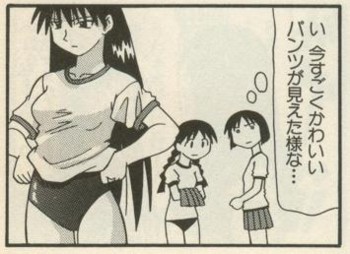
“I think I might’ve just seen some really cute pantsu…”
New

“Ah!?”
Another change was to the personal pronouns for “I” used by the hapless male student whose bike was stolen by Yukari in Chapter 1 from the masucline “Ore” to the gender-neutral “Watashi”, since he has somehow turned into a girl in the past decade (He fell into a Jusenkyo spring perhaps?)
Old

“Aaah! My Bicycle!!”
New
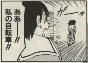
Aaah! My Bicycle!!
Joke Punchlines
This example that Sangencyaca selected is difficult to understand for someone who doesn’t remember the context (or never read the original), but it does give a good look at the bespectacled Koyomi’s different character styles.
Old

“Everything’s OK!!
That kid will be fine being by himself!”
“That’s not what you said in the beginning!!”
New

“Alright then…
Just shut the window properly and go back home quickly.”
Oppai
One of the most important (and noticeable) changes made clearly must be to the various oppai of the large schoolgirl cast.
This proved to be a rather confusing comparison for many, as many readers apparently mistook the old version for the new in our earlier post.
Old (Left) vs. New (Right)
The lack of toning lines, along with a change in Sakaki’s service mizugi from a less revealing, but more form-fitting one makes for a vastly different image, and it isn’t hard to see how some could easily mistake the two at a quick glance…
Fellow readers of moonrunes can find the fascinating full analysis of the changes at Sangencyaca here and here.
The new reprint of Volume 1 is also available.


the new art fits the manga so much more and for me it looks better. (especially the anatomy and character positions and poses)
old is better
Gained – Anatomy / Smoother rendering
Lost – Detail / Character
Chiyo looks too much like Yotsuba now.
And as much as I adore Yotsuba, I think that both characters should look different.
the old school Sakaki more better then the new one
i like the new one more. the old one was really deformed and looked really badly drawn (especially the legs and breasts)
I think Ayumu’s ”more feminine look” in the old version makes her look prettier. Or…it might be just me though(I also like Chiyo-chan’s old pigtails).